Particle Effects

Leave a comment

CC Particle systems II

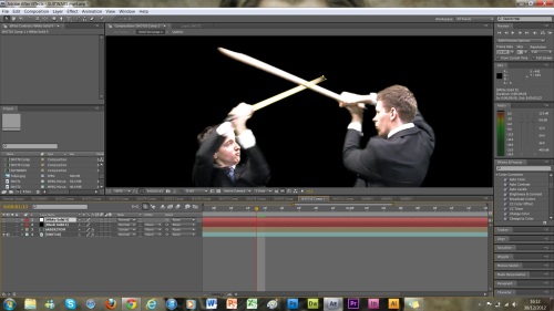
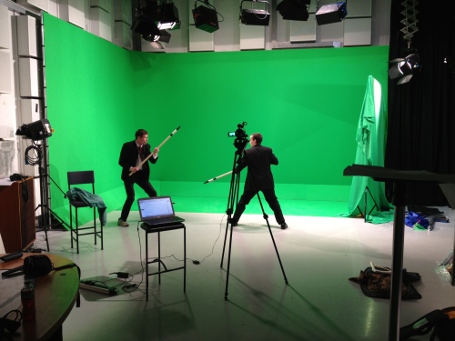
To create the effect for the saber clashes, I initially used CC Particle Systems II. This was because I had used it before, so I knew roughly what the parameters did, and not having used any of the others before, I didn’t want to lose myself in a mess of particles that made my laptop crash or something! As you can see, the image below shows the initial non-keyframed particle, set at particle explosion.

particle effect

There are several parameters on CC Particle Systems II. The first is ‘birth rate’. As I didn’t want to flood the area with as many particles as you see above, I keyframed the birth rate from just before every clash, to just after every clash like this: 0..3……..0. This meant that the birth rate would go from nothing, to 3 and then back to nothing after the clash, giving the effect that sparks were coming off of the sabers.

The next parameter is longevity: how long the particles stay alive for. I set this to 0.3 throughout the whole scene, as I didn’t want irrelevant particles scattered accross the screen for no reason. In real life sparks would die out after a second or so.

The next keyframeable parameter was the position (x,y). This simply meant that I had to place the particle exploder in the position of the clash after the last clash had stopped producing particles, and before the next started producing particles. As there were only 3 clashes, this was relatively simple to keyframe and maneuver the exploder.

Delving into the Physics parameters, I made sure that the velocity and gravity were both set to 1. Although, I (along with others I have since learned) tried altering these but it made little difference towards what I wanted it to do. Nevertheless, these settings were fine for what I wanted to achieve.

The final part of this effect was to change the birth and death colour. As sparks generally start off incredibly bright and fade out to an orangey colour, I set the birth to a light grey and the death colour to orange. I also made sure that these particles were lines.

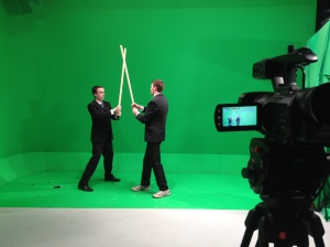
Below is an image of the effect this gave. However, it was lacking some substance in the main clashes.

particle birth death colour

Particle Playground

After consultation, I was steered towards Particle Playground, an effect we’d touched on but I hadn’t had much luck with.

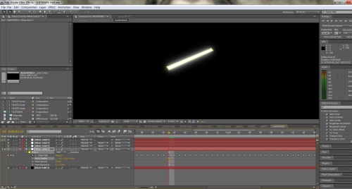
Below is just a shape layer, one that is set to go from bright white to orange in about half a second or so. This precomp then became the source for the particles in Particle Playground. I simply dragged this effect into a precomp, and just like in particle systems, I fiddled with the parameters until the particles acted and reacted the way I wanted them to.

1spark

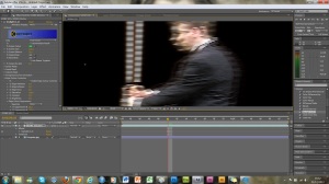
To link the layers, I used the layer map feature, and told it to map the shape layer above. I then duplicated the layer with the effect in 3 times, so that I could have a spread of particles going off in three directions. I then screened this comp with all of the settings tailored to match the settings of the other particles, which gave the effect in the image below. Not perfect, but it certainly looks a lot better than it did initially.

particle sparks

Saber Construction

Leave a comment

The first effect I added to my footage once it was all keyed out, was the light sabers. I had already practiced doing this before using a 3 second piece of footage I obtained from vimeo of two boys having a swordfight. I changed their swords into sabers and I felt that it wasn’t that bad for a first attempt.

The key to this technique was masking. I had to go frame by frame for about 10 solid seconds (24×10=240 frames) masking out the props we’d brought with us on the shoot. Initially I created a black solid and a white solid layer. I then hid both of these so that I could see the footage, and using the pen tool began painfully drawing around the prop frame by frame, A process that took about 2 hours per prop.

path tool saber

Once I had masked out the prop in every single frame, I revealed the white solid layer again so that I could physically see how much I had masked out. As it happened, I had missed quite a bit, so I went through it again making sure that every mask path was where it should be. Luckily this took far less time than the first run! Once I was happy with the result, I revealed the white later again and watched the motion of the white solid against the black background. Finally, I rounded off the edges that needed rounding off, such as any that were in shots that involved them being reasonably still compared to normal.

precomp saber

Once I was happy with that, I had to duplicate the white solid layer 3 times, giving me 4 white solid layers over all. I then pre-composed the black solid layer along with all of the white layers. It’s worth noting here that this had to be done, and had I not pre-composed, then like a lot of after effect effects, it simply would not have worked. The reason why I had to duplicate the layers was so that I could add different value feathers to each of them, giving the glowing effect seen in the picture below. Roughly, I aimed to have one at 1, one at 5, one at 15 and another at 30, although the true values once I output this as a file will probably be different.

feather mask saber

As you can see in the image below, the effect is pretty nice when seen masked out infront of the original footage, although it lacks colour.

screen layer saber

This is where the Color Balance effect on after effects comes into play. This is the main reason I had to pre-comp the layers, as this effect doesn’t work unless its a pre-composed effect. All I had to do was to drag the effect onto the saber mask composition, and simply increase the values of the colour I wished to portray. In this instance, it was blue. I checked ‘preserve luminosity’ so that it retained its glow rather than a flat outline of the main colour.


colour balance saber

I then repeated this task for every shot that contained a lightsaber, and also saved colour balance presets so that I only had to make each colour once.

tomVmike saber

Footer

Leave a comment

I didn’t want to make my footer really complex, so I simply coded it like this:

<footer>

There are only to <p> tags with a <br> tag to separate them. &copy; is the html way of writing the copyright logo. The <em> tag is the standard way of expressing italicised text and I used this to emphasise the point I was trying to make. This only appears on the home page and the events page, with both have asterisks aiming people to read this.

<P>Created by Daniel Tooley &copy;2013</P>
<br/>
<p><em>*We will not be liable for any damage to person or vehicle, nor loss of life</em></p>
<br/>
<p>

</footer>

Here is the css that went with it:

footer{

I set a clear attribute so that it didn’t conflict with anything around it.
clear:both;
Width is 100% so that it stretches right across the container.
width:100%;
Height is 120px to accomodate the text.
height:120px;
I’ve set the borders at 2px, and used the same box sizing rules as before, allowing me to have padding that doesn’t increase the size of the div.
border: 2px;
border-style:solid;
-webkit-box-sizing: border-box;
-moz-box-sizing: border-box;
box-sizing: border-box;
padding:3.75%;
The background colour is the same gradient as I used in the footer, and again I’ve added a yellow background as well so that when IE can’t read the gradients it pushes out a yellow background instead.
background-color:#FF3;
background-image: linear-gradient(bottom, rgb(255,255,5) 10%, rgb(224,224,9) 55%);
background-image: -o-linear-gradient(bottom, rgb(255,255,5) 10%, rgb(224,224,9) 55%);
background-image: -moz-linear-gradient(bottom, rgb(255,255,5) 10%, rgb(224,224,9) 55%);
background-image: -webkit-linear-gradient(bottom, rgb(255,255,5) 10%, rgb(224,224,9) 55%);
background-image: -ms-linear-gradient(bottom, rgb(255,255,5) 10%, rgb(224,224,9) 55%);
background-image: -webkit-gradient(
linear,
left bottom,
left top,
color-stop(0.1, rgb(255,255,5)),
color-stop(0.55, rgb(224,224,9))
);

This css shows that there is a box radius of 20px on the bottom left, and top left and right corners. The bottom right is a 200px radius so it matches the footer but in reverse. This matches the designs I drew for the footer.
-webkit-border-bottom-right-radius: 200px;
-moz-border-radius-bottomright: 200px;
border-bottom-right-radius: 200px;
-webkit-border-top-left-radius: 20px;
-moz-border-radius-topleft: 20px;
border-top-left-radius: 20px;-webkit-border-top-right-radius: 20px;
-moz-border-radius-topright: 20px;
border-top-right-radius: 20px;
-webkit-border-bottom-left-radius: 20px;
-moz-border-radius-bottomleft: 20px;
border-bottom-left-radius: 20px;
}

The overall effect of the footer is shown here:

footer


Keying footage with Keylight 1.2

Leave a comment

Once I had taken all of my shots, I needed to key out the green from them, so that I could add my own backgrounds. Unfortunately, the facility I used to shoot my film had no tracking points, which I guess in a way is a bonus because I won’t have to clone out any points which takes forever, but also means that I wasn’t able to film any moving shots as I would have nothing to track background positioning with.

To key out the green, I used the After Effects plugin: Keylight 1.2. Although there are many keying plugins for this program, this is the one we’ve used in class and is also the best from the choices by far.

Here is my original footage:

key1


As you can see, the backdrop is green. To eliminate this colour, I dragged keylight over the footage to activate the effect, then used the dropper to find the green I wanted to key out and hey presto, the green is gone! (below)

key2

Although the green is gone, I needed to refine the edges and make sure that there was no unkeyed green still lurking around partly visible, as it would be noticed. The best method I found for doing this quickly yet incredibly effectively was to first change the view from final result to screen matte, this left black and white only. The idea was to clip back the white and the black, until the black was the blackest without disintegrating the figure, and the white was the whitest without adding to the figure. Here was the outcome:

key3

Although you may not notice it, there are still slight white lines around parts of the figure in the shot, however, I shall be using an incredibly light background as my environment. To demonstrate how little you will notice the lines if at all, I have added a red solid as the background so that you can see how much it affects it.

key4

I repeated this task with every shot until all of them were as clean as I could make them.


Composition

Leave a comment

To create my visual effects piece, I am going to use Adobe After Effects. This will allow me to draw on all of the skills I learned last year, as well as taking from new ones I have learned this year and in my own time.

Firstly, I had to make a composition for the videos to sit in before I could fiddle around with them. To do this I simply started a new project in After Effects, and under composition, clicked add new composition. The settings that I had used on the camera were going to be the ones I used in this, otherwise I would probably start having problems like I did with my file render from 1080p to 1080i.

My dimensions were 1920x1080p. This matched the size of the videos and allowed me to work with the whole shot. I can move things around once I’ve keyed out the green from every usable shot.

Cut

Leave a comment

Yesterday I looked through all of the footage I had taken, and put together a cut of the shots I wanted to use. I had about 10 minutes worth of footage to look through and cut down to 30 seconds of footage that I will use in Adobe After Effects to create my visual effects piece. To do this I used Adobe Premiere Pro. I imported the clips that I wanted to use in my piece, and cut them to appropriate lengths before ordering them to create a chronological sequence.

Here is the full sequence in order:

As well as rendering the full sequence, I also decided that it would be wise to take every shot individually and render them into their own .mov files. The reason I did this is so that when I come to editing the final piece in After Effects, to keep the composition tidy and easier to manage, I want to be able to pre-comp every shot on its own. I wouldn’t be able to do this on After Effects if I used the complete sequence and it would make life harder over the course of editing. Plus it means that if the green is slightly different on the shots, I can use the Keylight plugin on each shot instead of having to have multiple effects on the same composition. This should save me a lot of time and hard work!

Problems

In Premiere Pro, I previewed the sequence before I rendered it, and it was absolutely fine. No problems whatsoever. However, when I imported my footage into After Effects I realised that when I had rendered the footage on Premiere Pro, I had rendered it in the wrong format. I shot the footage in 1080p24 and accidentally rendered the footage using 1080i24.

This was the result:

lines 1

This happens every 3-4 frames, particularly during motion intensive shots.

lines 2

I did some research and discovered that the problem was to do with interlacing. I discovered that shooting in one format and rendering in another would come up with this problem, but I hadn’t found any footage that confirmed that this was exactly what was happening in my render. I refined my search, searching “1080p footage rendered to 1080i horizontal lines problem” ,and found this thread which confirmed my diagnosis:

http://hupitgaming.com/forum/16-help/276484-interlace-problems-when-rendering-hd-pvr-footage-in-sony-vegas

The video in this thread displayed exactly the same problem that I was having. This means that pretty much all of my work yesterday was for nothing. Well, not quite. Luckily I saved the Premiere Pro project file! I just need to re-render the footage using the correct settings and the problem (hopefully) will be solved! While i’m at it, I am going to cut a couple more of the shots down as I feel that a few shots linger too long and remove any suspense or action implied by the script. I’ll also round it off at 30 seconds rather than 35.

Hero

Leave a comment

The hero is the main feature of my website. Although my location page will have an interactive map, I will still include this hero div as it is the central piece to my website. After looking through and researching quite a few different types of slider, I decided that the one I would use is the NivoSlider. This is because it was the best looking ready responsive slider I could find. I looked at various sliders and carousel jquery plugins, but at the end of the day I thought that although I couldn’t find a good looking, smooth responsive carousel that matched exactly what I wanted it to look like, it would be a lot easier to use a responsive slider as i’m not 100% confident on implementing jquery and javascript into my work, especially when it comes to altering java code. This is something I do want to learn, but I haven’t got enough time during this assignment to funnel all of my time into one aspect. Besides, the NivoSlider looks great!

jquery slider 3

Here is the HTML and CSS for the Hero:

<div id=”hero”>

This div defines the theme the nivo slider will be using, linked to a folder in the root called ‘themes’
<div class=”slider-wrapper theme-default”>

More

Shoot

Leave a comment

Today I shot the footage I will be using for my assignment. I had to wait until today to do it as I needed to ensure that both of my volunteer actors were available and could travel to the location we were shooting at. The location was the Powell building at the Canterbury campus, as we were using the green screen facilities that aren’t available at the Broadstairs campus.

Equipment:

JVC GY-HM100E HD Video Camera
Large Tripod
Green Screen
Studio Lighting

I brought a mic and boom just in case I changed my mind or wanted some sound effects, but for the purposes of the shoot I did not capture any dialogue. This is reflected in the script.

The shoot started at around 10pm once we’d arrived. Before we shot the footage we adjusted the lighting, camera settings and the capture format. This took around half an hour to complete and once we’d got everything sorted we started shooting.

The image below shows the set up we had whilst filming. I had my laptop set up for reference in case of problems and to preview the footage we’d captured.

photo (4)

photo (3)

The next stage will be to use the footage I’ve captured, and create several .mov files for each individual shot (cut to fit) as well as a full length version. To do this I will use Adobe Premiere Pro CS6.

3D Image Slider

Leave a comment

Found this during my creative web research. I’m considering buying a license and using it in my portfolio website!

“The transition between pictures is so smooth, and the 3d element makes it even better than the one i’d seen before. There were many different transitions, and the shadow effect was pretty good too. This one would cost me $12 to purchase a license to use this on my websites, but I think that whether I use it for this assignment or not, I want to be able to use it at some point! I might look for an alternative first that doesn’t require a license so that I don’t have to pay for it though”

http://codecanyon.net/item/ccslider-jquery-3d-slideshow-plugin/full_screen_preview/162445?ref=lvraa&ref=lvraa&clickthrough_id=97927834&redirect_back=true

3d slider

Sliders

Leave a comment

One of my designs included an interactive slider that I could use to switch through 3-5 different images/offers. I researched some j-queries that offered this.

Slider 1

New FancyMoves Jquery Product Slider

jquery slider 1

This is the ‘FancyMoves’ slider. In my design I wanted a slider that contained a large central image, with about a third of the other pictures shown either side before changing. This one does pretty much what I wanted it to do, but I thought that it showed too much of the other pictures. I want the attention to be focused on the central image rather than being drawn to those around it.

Slider 2
http://galleria.io/

jquery slider 2

I searched for a couple of hours looking for one that looked exactly like what I wanted, after which I decided to be a bit more open minded into choosing a slider that looked good and functioned in the same way that essentially I was trying to find in the slider I initially designed. This slider showed a small thumbnail of the image in the main picture area. I liked this one because it offered the chance to use more images than the last one, but I still wanted to see what else I could find.

Slider 3
http://nivo.dev7studios.com/

jquery slider 3

The ‘Nivo’ slider was simple and effective. I liked that it was widescreen and it didn’t draw attention away from the main picture. The slide indicator was subtle, and when you hover over the slider the autoplay feature stops,which is handy when wanting to focus on one image.

Slider 4
http://wowslider.com/jquery-slider-mellow-blast-demo.html

jquery slider 4

The ‘Wow Slider’ was pretty similar to the ‘Nivo’ slider. The difference being that this one had 11 different preset transitions between images to choose from, rather than playing a random assortment of transitions (although i’m pretty sure you could randomise the transitions on this also).

Slider 5
http://codecanyon.net/item/all-in-one-bannerjquery-rotatorcontent-slider/1534434?ref=wdgs

jquery slider 5

I saw this slider, and it looked like what I wanted, but it revealed too many pictures, it wasn’t smooth enough in its transitions, and it also had an annoying little timer wheel in the top left of the main image to indicate that the slider was about to move on to the next image.

I then refined my search. The one above was listed as a carousel slider. So I changed my search to ‘jquery carousel slider’.

Carousel 1
http://www.bkosborne.com/jquery-feature-carousel

jquery carousel 1


My search immediately came up with what I wanted, albeit this one was slightly wider than I wanted (by this I mean the images on either side were too wide). It also revealed the slide indicator which has been a feature of a couple I’ve seen, but the way that this one does it renders it too messy for what I want, and if I use a slider like this i’d rather it was simpler in its conveyance.

Carousel 2
http://www.jacklmoore.com/monte

jquery carousel 2


This was exactly what I wanted. It had smaller previews of other pictures, a better focus on the central image, and a subtle slide changer with an autoplay function. The only problem was that you had to physically press a button to pause the slides, and the transition was a bit boring because you had to wait for one image to slide across before the other will take its place.

Carousel 3
http://fredhq.com/projects/roundabout

jquery carousel 3

I liked this one, and if you imagine pictures instead of grey blocks it looks a lot better. The only downsides to this one were that you had to click other pictures to rotate the carousel, and there was no autoplay function.

After looking at lots of different sliders, I think I might rethink my design and go for a ‘one image at a time’ format. I liked the three wider image sliders in my searches, and these would be easier to make responsive than a carousel slider. I don’t plan on using a slider for viewing on a phone, but I want it to remain a feature of the tablet version of my website.

During my searching, I came across this slider that I really liked:

3d Slider
http://codecanyon.net/item/ccslider-jquery-3d-slideshow-plugin/full_screen_preview/162445?ref=lvraa&ref=lvraa&clickthrough_id=97927834&redirect_back=true

3d slider

I am really considering using this slider. The transition between pictures is so smooth, and the 3d element makes it even better than the one i’d seen before. There were many different transitions, and the shadow effect was pretty good too. This one would cost me $12 to purchase a license to use this on my websites, but I think that whether I use it for this assignment or not, I want to be able to use it at some point! I might look for an alternative first that doesn’t require a license so that I don’t have to pay for it though.


Older Entries