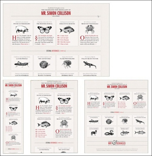
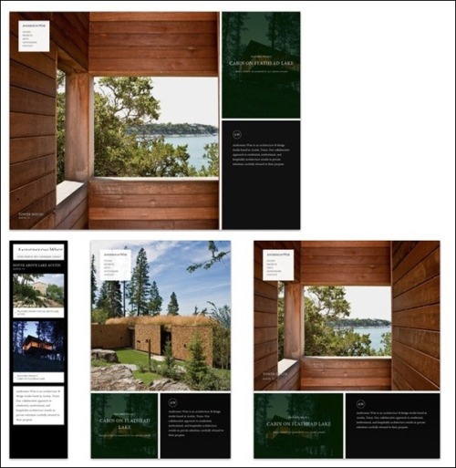
After reading the brief, I have learned that the website I have to create will be a responsive website. I understand this to be a website that can adapt dimensionally based on the size of the browser/media device that the site is being viewed through.
To help with research towards coming up with an idea to fulfil the brief, I looked at a number of responsive websites to see if there were any similarities, and what would look good. I used TripWireMagazine.com, as they had an article entitled ‘Examples of Great Responsive Web’ which pretty much summed up what I wanted to research!
http://www.tripwiremagazine.com/2012/06/responsive-website-design.html
(I have included this link as this is where the images used in this blog are sourced)
Example Sites:
Mr Simon Collison – Blog?
http://colly.com/
Anderson-Wise Architects
http://www.anderssonwise.com/
Boston Globe
http://www.bostonglobe.com/

These were the three websites out of the list that stood out to me more than the rest. My reasoning for this is that these websites all adapt a relatively simple layout, nothing too fancy and nothing to draw your attention away from the message that each site was trying to convey to the audience (with the possible exception of the architect’s website which I believe uses imagery to convey it’s message, rather than a large body of text)
I want to incorporate a more minimalistic approach to my responsive web site, not through lack of content of visuals and aesthetics, but through the educated use of layout, colour theory and creative design. I want the user of my website to know exactly what it is about as soon as they open the home page, and for it to be accessible (focusing on the key elements) through a range of media devices, without losing any of the aesthetics or quality portrayed in the original web document.


Leave a comment